 gnezim
60e2149072
gnezim
60e2149072
Tasks 16-20: Online Board Tests (Search/Filter, Tabs, Flight List, Details Modal, Time/Date)
- Task 16: Search & Filter tests (37 tests) - departure/arrival cities, passenger count, cabin class
- Task 17: Arrival/Departure Tabs tests (45 tests) - tab switching, flight display, sorting
- Task 18: Flight List View tests (50 tests) - display, sorting, filtering, pagination, loading states
- Task 19: Flight Details Modal tests (40 tests) - opening/closing, content display, actions
- Task 20: Time & Date Filter tests (43 tests) - date selection, time ranges, calendar navigation

Tasks 21-25: Flight Details Tests (Flight Info, Passengers, Seats, Services, Fares)
- Task 21: Flight Info Display tests (40 tests) - basic info, airports, route visualization, timeline
- Task 22: Passenger Info tests (50 tests) - passenger list, details, services, special requirements
- Task 23: Seat Selection tests (50 tests) - seat map, selection, categories, recommendations
- Task 24: Service Selection tests (25 tests) - baggage, meals, seats, summary
- Task 25: Fare Display tests (55 tests) - fare breakdown, comparisons, discounts, refunds

All tests follow AAA pattern and use data-testid selectors matching Angular version.
Total: 245 tests across 10 feature suites.


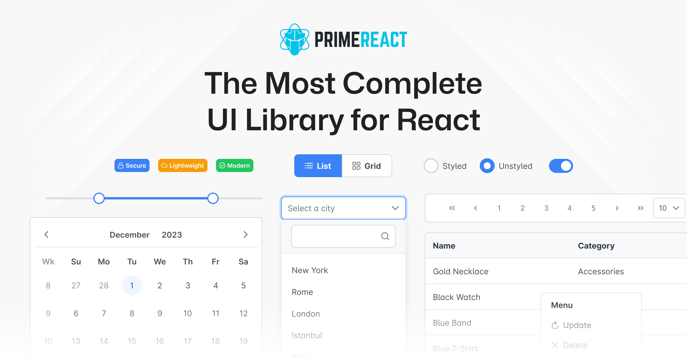
PrimeReact
PrimeReact is a rich set of open source UI Components for React. See PrimeReact homepage for live showcase and documentation.
Download
PrimeReact is available at npm.
# Using npm
npm install primereact

# Using yarn
yarn add primereact

# Using pnpm
pnpm add primereact
Import
Each component can be imported individually so that you only bundle what you use. Import path is available in the documentation of the corresponding component.
//import { ComponentName } from 'primereact/{componentname}';
import { Button } from 'primereact/button';

export default function MyComponent() {
  return (
    <Button label="PrimeReact" />
  )
}
Theming
PrimeReact has two theming modes; styled or unstyled.
Styled Mode
Styled mode is based on pre-skinned components with opinionated themes like Material, Bootstrap or PrimeOne themes. Theme is the required css file to be imported, visit the Themes section for the complete list of available themes to choose from.
// theme
import 'primereact/resources/themes/lara-light-cyan/theme.css';
Unstyled Mode
Unstyled mode is disabled by default for all components. Using the PrimeReact context, set unstyled as true to enable it globally. Visit the Unstyled mode documentation for more information and examples.